This page provides tools to visually and statistically analyse human movement patterns in London during the year 2020. By selecting different time intervals, you can explore the impact of various COVID-19 measures on urban mobility, compare mobility trends across key phases, and delve into detailed statistical summaries. Use the interactive maps and graphs to uncover the dynamics of movement throughout the pandemic.
This section allows you to compare movement patterns in London across different intervals during 2020. Select two maps to compare using the dropdown menus below. If you compare two intervals that next to each other, there is also a difference map available below the maps, to visualise the changes between these intervals.
The comparative analysis examines the data across the seven distinct intervals during 2020, highlighting mobility trends and their association with key government interventions. By analyzing the provided graphs and summary table, we can identify both temporal patterns and notable deviations in mobility during critical phases of the pandemic.
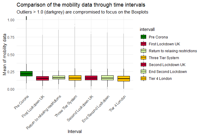
The graph below illustrates the movement trends across all intervals, providing a visual summary of average movement levels and their fluctuations. Key observations include:

Figure 1: Movement trends across time intervals, showcasing the average activity levels and their changes over time.
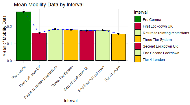
The following graph provides a detailed statistical view of mean movement levels across the seven intervals. This visualisation highlights the differences in activity during various phases, with significant contrasts observed between lockdowns and reopening phases:

Figure 2: Mean movement values across intervals, highlighting mobility reductions during lockdowns and recovery during reopening phases.
The summary table below offers a comprehensive view of movement statistics, including minimum, median, mean, and maximum values for each interval. These metrics provide deeper insights into how movement distributions varied across London during different periods:
Table 1: Summary of movement statistics for each interval, showcasing key metrics such as median and maximum activity levels.
These observations demonstrate the significant impact of COVID-19 policies on human mobility patterns. The contrasts between intervals highlight the effectiveness of lockdowns and the gradual recovery during reopening phases.